The Best Return For Your Money
Spacing: The FINAL frontier.
These are the travesties of the bakers-who-don't-plan-ahead-well.
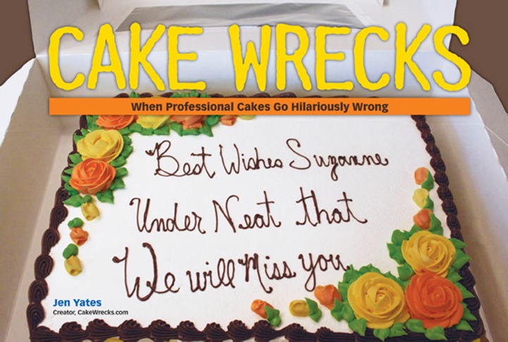
Plus the ones who like to center-justify their text so each line only has four letters each, because, yeah, THAT makes sense.
(Great. Now I really want there to be a band named the Cong Rats.)
Or how about just three letters each?
Que?
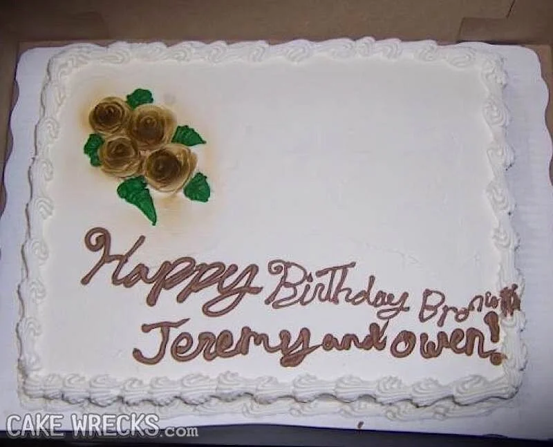
I know how those long words can sneak up on you, bakers, but the important thing is to make sure everything is legible and spelled correctly:
Oooh, so close.
Less close.
You're kidding, right?
WHAT IS WRONG WITH YOU PEOPLE??
Ahem.
Then there are the bakers who get their spacing right, but throw in a dash anyway:
Dash it all!
And, uh, this person:
Oooh, if only there'd been more space for the baker to work with!
And finally, there are the bakers who are just batpoop insane:
Forget the writing - I want to know what that drippy brown spot is.
Or...do I?
o.0
Thanks to Krissy K.,
Christine D.,
Justine J.,
Chris & Jessica,
Deborah B., Carl J., Marina C., Angela W., Bronwyn G., & Angie W. for really exploring the
bakery space.
*****
P.S. Not entirely related but now I have space on the brain, so you get this:
Space Cat Fabric Shower Curtain
The longer you look, the better it gets. :D (THAT'S NO MOON.)
*****
And from my other blog, Epbot:


